
Why buttons press our buttons


Created in partnership with

Created in partnership with
You may also like
Popular resources
First, let鈥檚 be clear: we don鈥檛 hate buttons. But we do have an issue with how some components of web pages, including those click-inducing buttons, are implemented across digital interactions. Let me explain鈥�
Our busy content design team is spread thinly across multiple projects, services and products. So, when members of our university community make requests for web pages, often with little explanation about what they are trying to achieve and who their users are, this can be incredibly challenging for our team. One critical pain point is how we interpret stakeholders鈥� suggestions and decide whether to implement them.
- 色盒直播 podcast: the AI university is coming
- Spotlight: Tech solutions for the post-Covid campus
- Why is digital transformation such a challenge for HE?
We also talk a lot about consistency of experience, content standards and what would help speed up the design process. This article reflects some of these conversations, conclusions and decisions we鈥檝e come to as a team, as well as what we鈥檙e doing about them.
Linking content design to university strategic goals
To maintain consistency across our website and other digital services, we work from , which is effectively a library of guidance, examples and design patterns that focus on key digital interactions. It allows us to move at pace and provide effective digital experiences that support the , such as equality, diversity and inclusivity.
When we talk about content design in the context of design systems, we are not necessarily talking about style guides. We are referring to how we create repeatable design patterns, backed by research, and agree upon their correct use as a team. Having a clear understanding of the solution to a problem allows it to be reapplied when the same problem comes up somewhere else 鈥� and at scale.
But there is more to it.
It鈥檚 all about context
Turning a content design eye to your own design system helps keep products consistent and scalable. It also helps keep designers sane. They have to understand this collection of components, patterns and tools and, more importantly, the right contexts in which to use (or not use) them.
Without this, you can easily lose the benefits that those components were designed to provide, such as greater accessibility for users who rely on assistive technology to browse websites.
Consider, for example, a common website component: the . We looked at research groups and the need for the contact panel, in terms of discoverability and consistency of experience. The design system is an especially valuable tool. In our content management system, there鈥檚 a lot of flexibility with the component itself. This flexibility allows us to present many different combinations of contact information consistently, but also increases the risk of the component being misused. Here鈥檚 an example from the Coherent X-ray Science group:
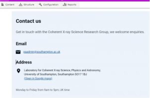
Checking in with the design system helped remind our content designers of best practice. The design system removes the need to rely on other members of the team for this information and so also helps them to progress work more quickly.
So what about buttons?
We have nothing against buttons. We鈥檙e only using them as an example of a content design decision when building a product or service.
When a component has context, you can make the right decision by default. For instance, our design system contains information about and what they communicate. It gives explanations and showcases our button types. It鈥檚 flexible, but it can鈥檛 always tell you when to include a button or not.
When you add the context and content choice to the system, the designer knows the right button, for example, for each content type.
At this point, we probably want to stop thinking about buttons in isolation and turn our attention more to a sense of journeys and the next steps a potential user group may choose to take, if at all. And that鈥檚 what we鈥檙e hoping to move towards.
For example, our new include Drupal fields where primary buttons can be applied using simple HTML code. These are present in the design system but used sparingly by content designers despite the technical flexibility to use them more liberally.
Here鈥檚 our design system page for this product, including for 鈥淗ow to apply鈥�, which uses primary buttons. When cross-referenced with , it鈥檚 easy to understand that the primary buttons are for important tasks.
Journeys can be broken if there is not enough understanding of:
- when to use and (more importantly) not to use a button
- what button type is most appropriate
- where to place a button on a page.
Throw in the human need to want to please people (such as when the content designer does exactly what is requested on a ticket) and things can go really wrong. This is where training comes in 鈥� to help them question any request we get in terms of the real value it will deliver for our users. After all, we鈥檙e here to represent them.
The need for good design choices
So, to clarify our position, this is about how a design system, made up of well-chosen components and patterns, does not replace the need for good design decisions. There are a million ways to make bad choices using good components and patterns 鈥� in the same way a piece of text can follow a style guide but still not read well or give users what they need.
The precedent for this in government is interesting. and are both solid and allow for little variety 鈥� you can only prototype in code, so there鈥檚 limited potential to deviate, all the way through from sketching to development. Even with all that, there鈥檚 still the need for hefty and sophisticated design reviews and assessments to make sure teams are making good decisions. This is because there鈥檚 still a lot of room for poor usage.
Question everything everywhere all at once
Getting the whole team on the same page is important, especially around the purpose of the system and how to use it. We鈥檇 spent many meetings in the past going back and forth about whether we needed more guidance for our team or for the disciplines we collaborate with. We wanted to make sure we were crystal clear about this as a group, so we have plans to create more training and simple guidance to ensure the wider team understands how to design for specific goals and journeys.
Question everything, everywhere and all at once to get out of your comfort zone and ensure that the people who are interacting with your services get the best experience when that happens. Being comfortable with awkward conversations is important, and it gets easier as you become more familiar with the work, design principles and flows.
We鈥檙e iterating as we go along. We鈥檙e not over buttons yet. They have a role to play, just not in every page or journey鈥�
Ayala Gordon is associate director of digital user experience at University of Southampton.
This is an edited version of the post 鈥�鈥�, which was first published on the University of Southampton鈥檚 Digital Team Blog.
If you would like advice and insight from academics and university staff delivered direct to your inbox each week, .
